YOU AND I. ROLF
Custom Logo & Branding Design
moodboard

CONCEPT SKETCHES
CONCEPT 1
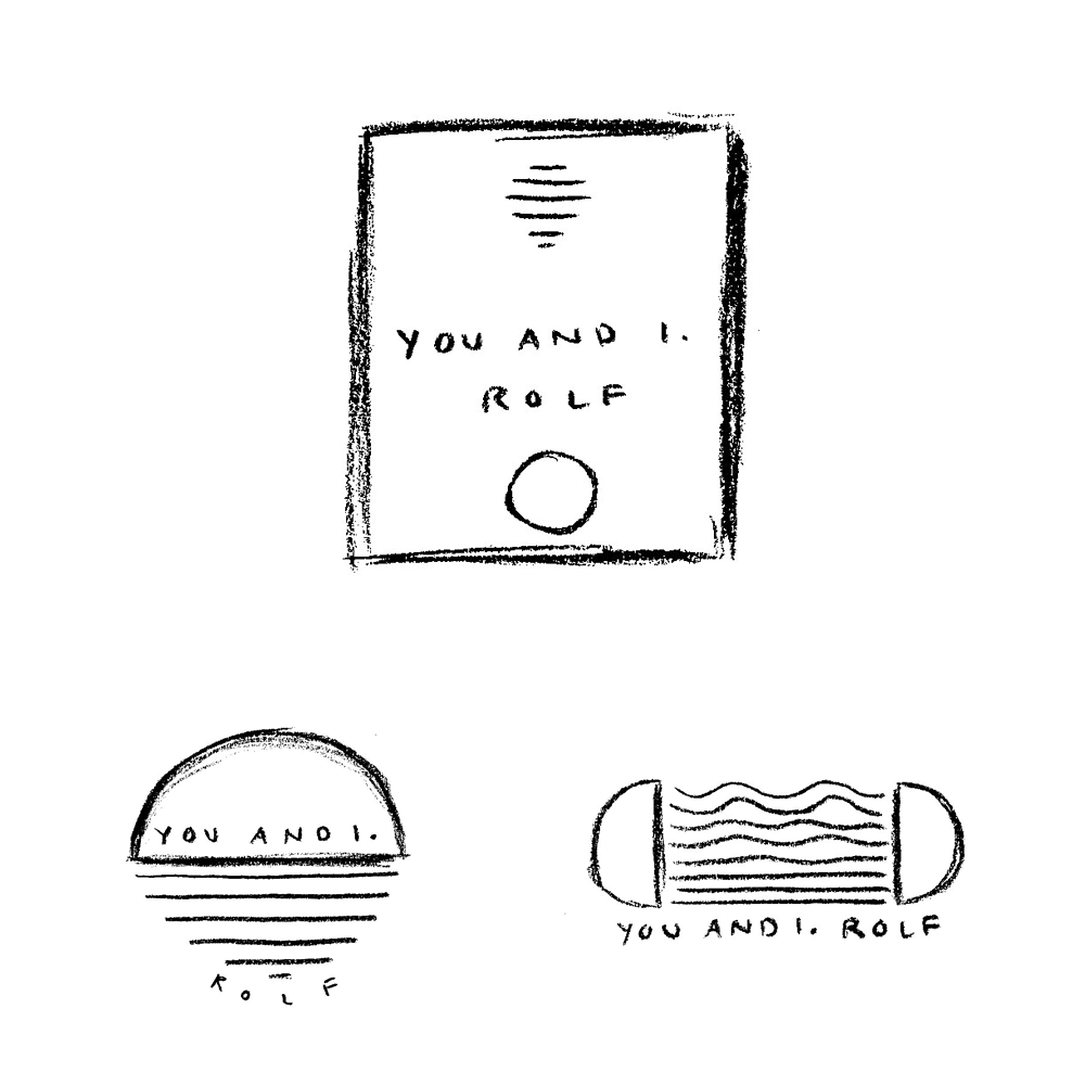
THE FERN
CONCEPT 2
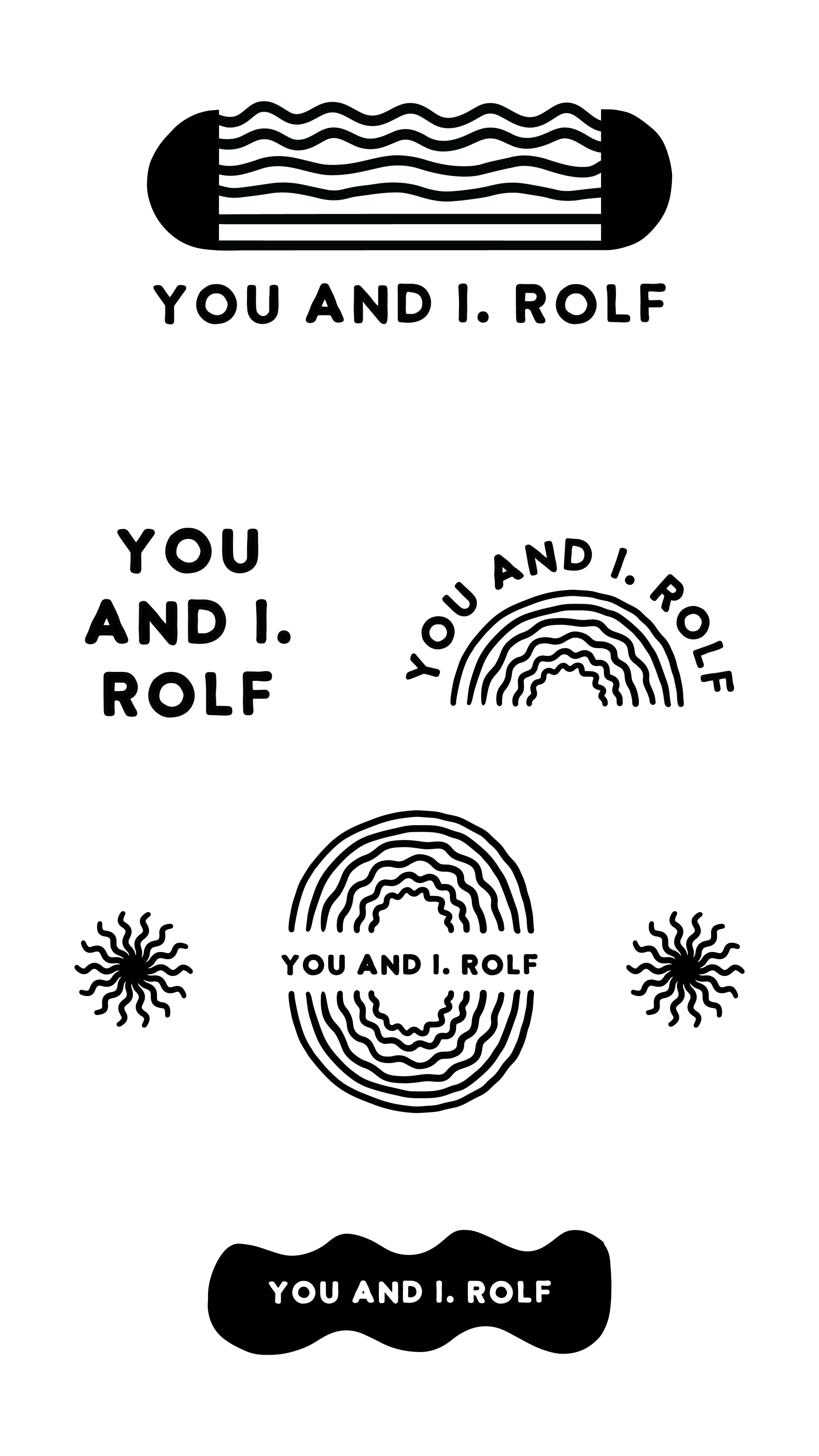
SUN AND SHADOW
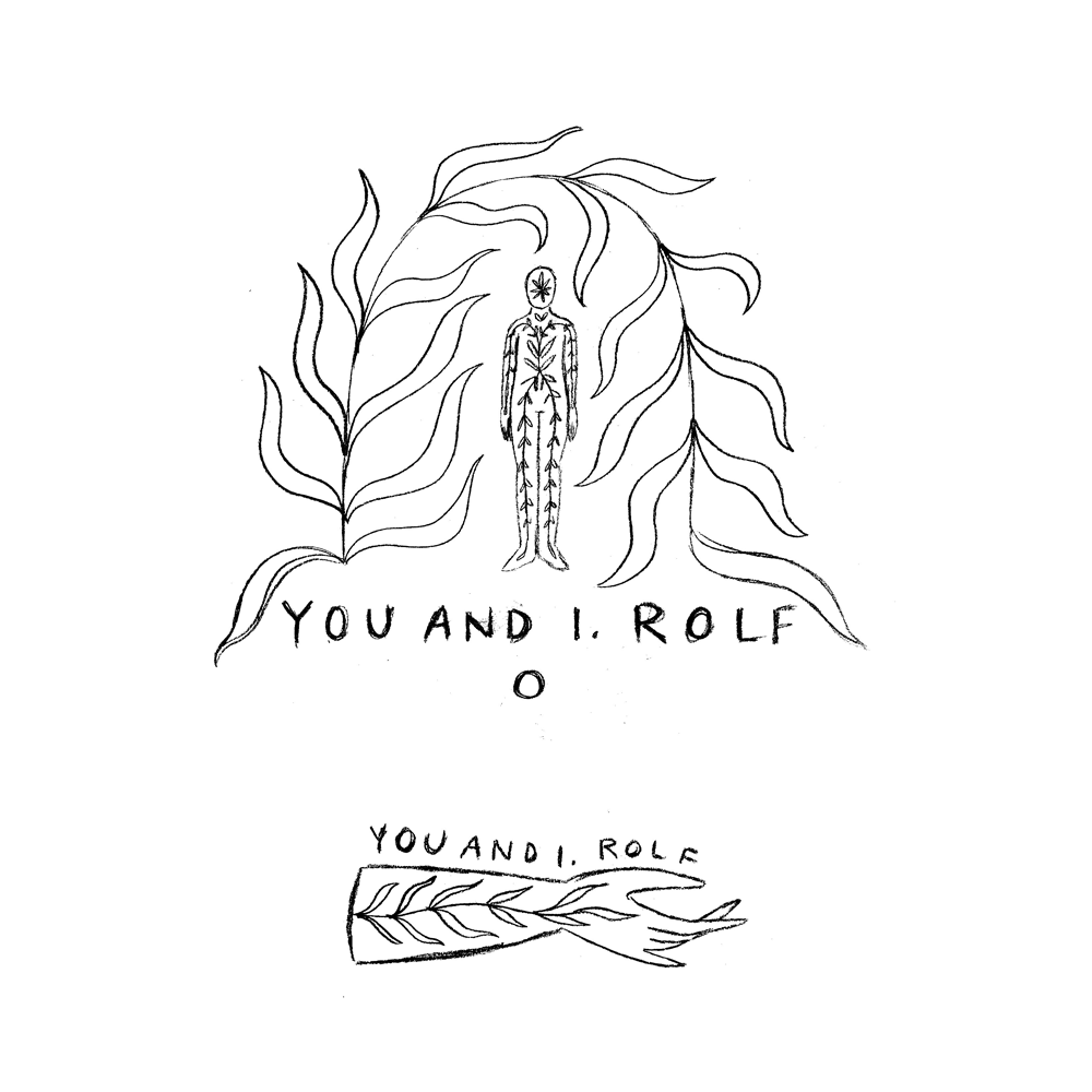
The fern is such a powerful form in nature, and I kept being drawn back to it when coming up with this sketch due to it’s beautiful resemblance to the spine (and even when looking at an illustration of a nerve cell I’m reminded of a young fern still curled in on itself, just waking up). To me this concept resembles energy’s flow, and our relationship to how we channel that through the spaces within and around us.
I see a big emphasis on the artwork and illustration for the main logo, with the secondary and sub marks drawing from that world with more open space and minimal artwork / detail. I also envision a slightly textured typography (either hand painted or something modern) that coordinates with the hand painted elements.
I imagine a lot of the artwork to be in positive / negative relief (think Notan paper cutting), to really draw out the inner images of the fern.
Sun and shadow are themes that I’m called back to time and time again in my work (and just everything in general), so when you had mentioned sun imagery on the questionnaire form, I knew I wanted to include a concept that leaned into it. This concept is meant to be bold and modern, while providing subtle images of transformation, time, and healing.
Like the fern, I imagine a lot of that paper cut contrast here, with the modern shapes popping
The big draw with this concept will be less about the illustration or artwork itself, and much more on the typography. I see it being clean and modern, while retaining a touch of whimsical character that feels cohesive with the unique shapes and motions of the design.