BITTER/SWEET & CO.
Custom Logo & Branding Design
moodboard

VISION
My biggest focus with the logo and expanded design is to create a really unique image right out of the gate that makes a lasting impact (lean into the slightly weird), while including a sense of familiarity with a cozy / midcentury modern inspired color palette. I envision pairing the final artwork with a typeface that mirrors that bright energy, while being bold and fun enough to stand out all on it’s own.
Because the logo is the face of something so alive and vibrant as floral design, I want the artwork to capture all of the facets of that. How florals can be used in celebration or appreciation or grieving. How they are the constant inspiration for so much of what we see in the world, from pattern design to architecture. The three concept sketches that I come up with will be meant to reflect the power they have on both our imaginations and our personal touchstones.
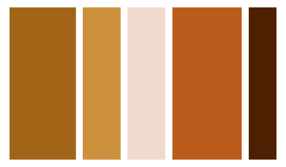
COLOR PALETTE
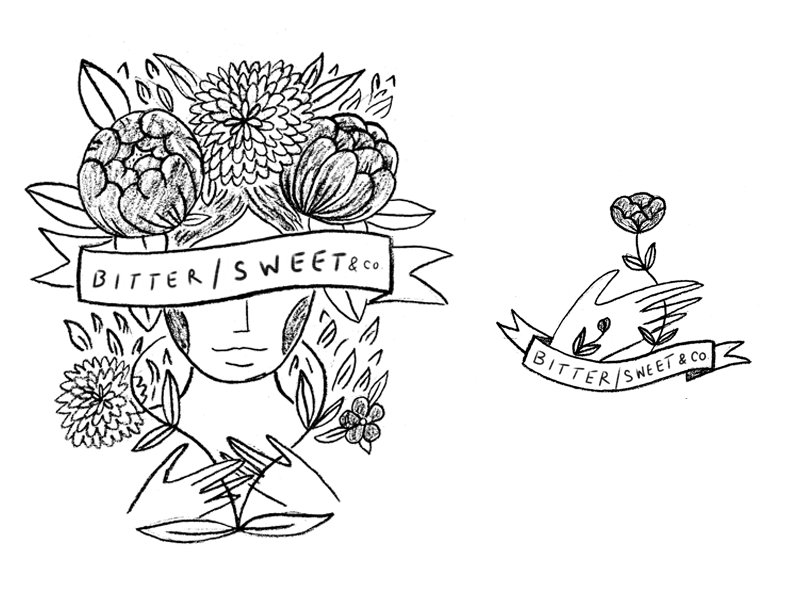
ROUGH SKETCHES
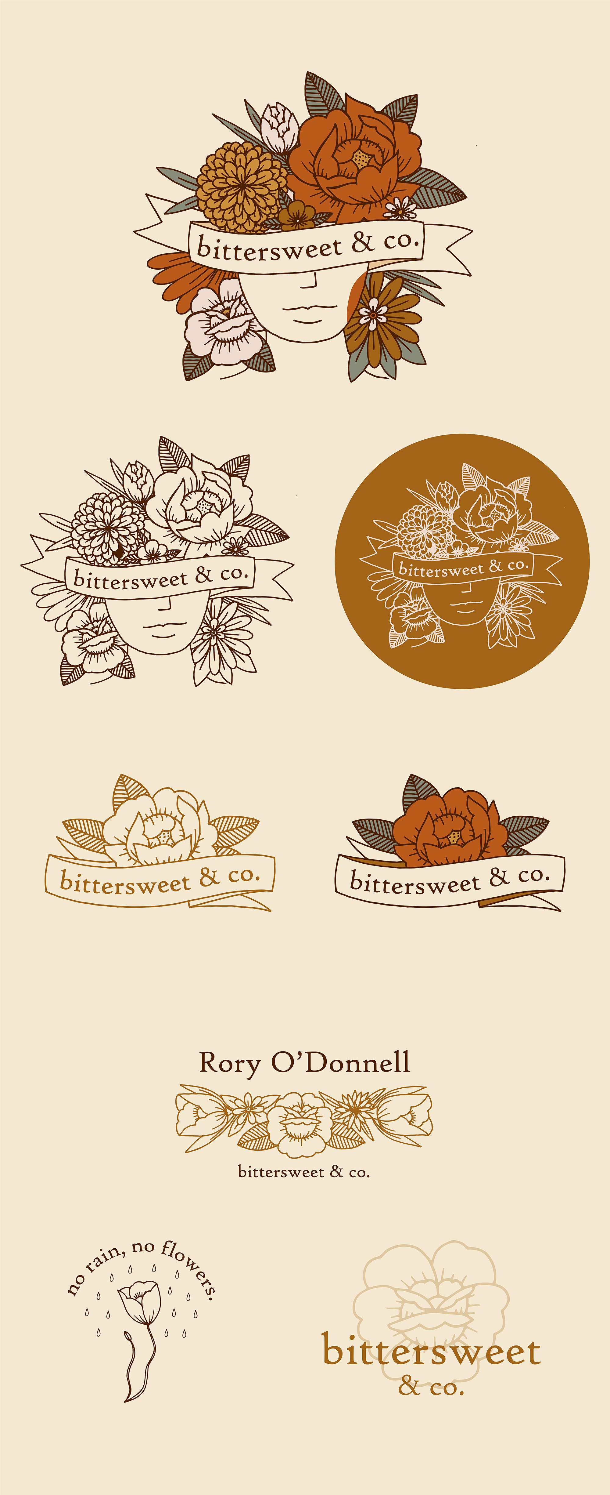
CONCEPT 1
This is the concept that is meant to reflect the Myra Oh inspiration that you had initially mentioned in your form! The main logo would be super lush, containing a plethora of florals that fill and frame the design, with a sweet vintage-book-cover style banner sweeping across.
Because the main artwork is so vibrant and detail dense, the secondary logo and sub marks would be scaled back a bit with a focus on pulling out individual elements and florals and expanding on them more minimally.
CONCEPT 2

This concept is a little step into a weirder territory, with the mirrored vase women representing the Yin / Yang of the Bitter / Sweet. I still wanted to represent that bold traditional tattoo style inspiration here, with the florals being in the same vein as concept 1.
The secondary logo and sub marks would focus on the florals themselves, with some patterns pulled from the vase. itself.
CONCEPT 3

Within every lineup I like to include a concept that is super different from the other two.
Here, I was inspired to use a combination of mid century modern ceramic shapes, with the whimsically minimal style of Japanese design. There is a lot of open space in this concept, with focus on simple forms placed within unique compositions.
The typeface would serve as an opportunity to echo the serene yet eccentric qualities of the artwork.